Whenever one thinks of interior design, one of the first things that you may hear is that you should avoid dark colors as they can make a room seem smaller and more stuffy. But this is not necessarily true. If you are able to use the dark and moody interiors well, your home can still feel and look airy. There are some tricks you may want to keep in mind when working with dark interiors.
Decorating with Dark Colors
The following are some of the tips to consider while decorating with dark colors.
Contrast
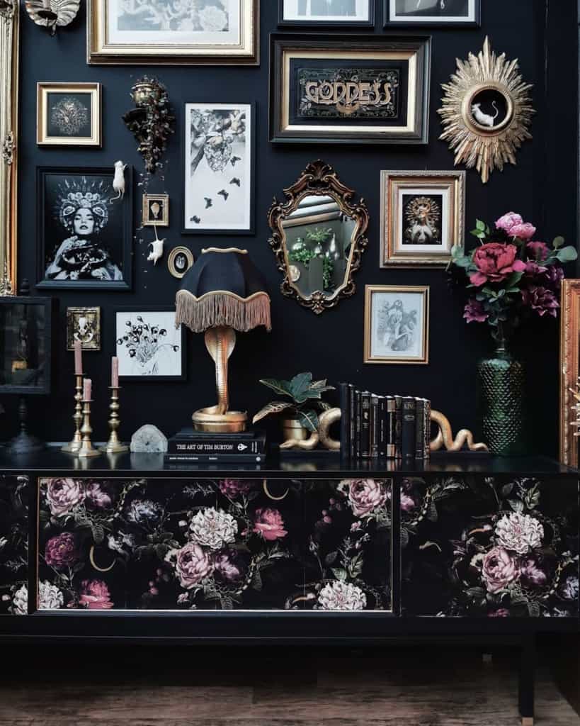
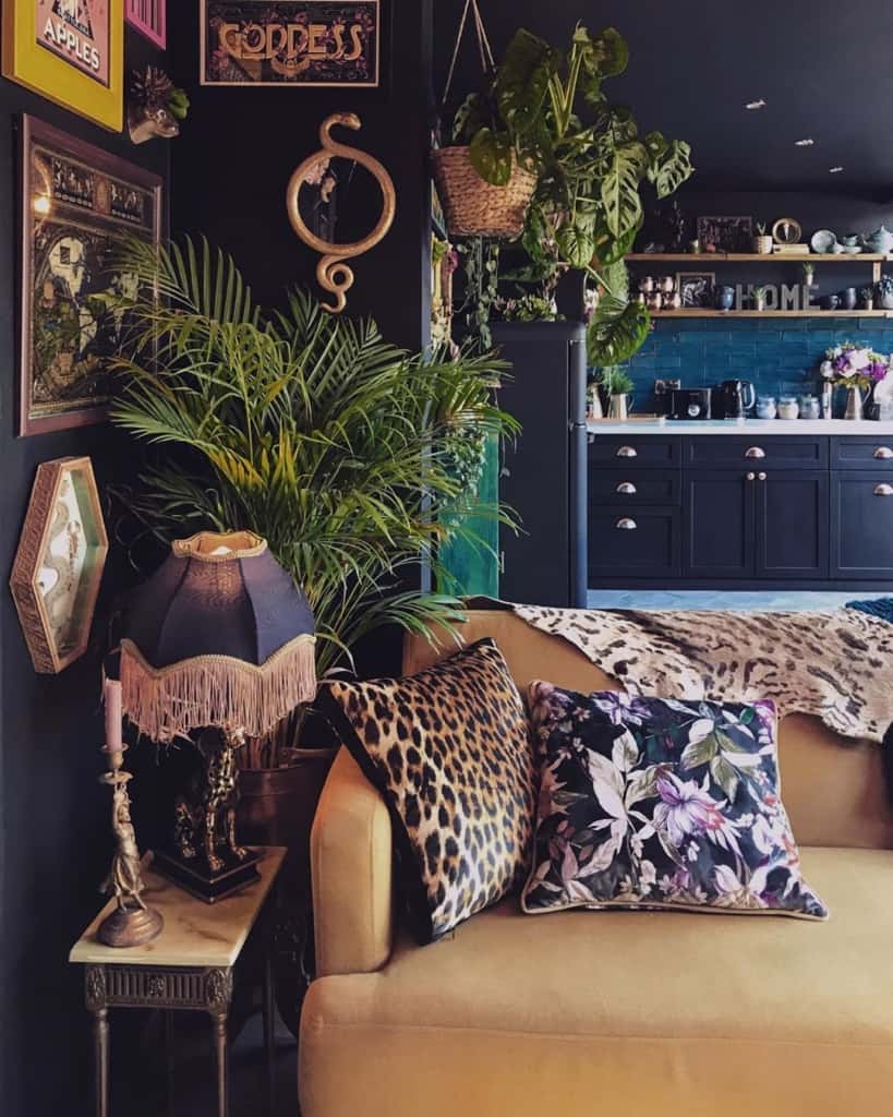
One of the first rules when working with dark colors is to make good use of contrast. The use of contrast will also provide a balance and will keep the dark hues from overpowering the decor. Do not hesitate to experiment with different materials and textures when it comes to the furnishing of your room. If your walls are dark, you may want to pick a chair or a curtain that pops against that dark color. You can also play around with geometric patterns that will catch the light and stand out against the dark background. For your curtains, rugs and other upholstery, you should look at several options of fabrics and textiles to put together a dynamic and interesting look that would be described as more than simply ‘dark’.
Patterns
While it is always exciting to work with vibrant patterns and designs when you are decorating a dark room, it is best to keep the use of patterns to a minimum. The dark color of the room will already add depth and vibrancy to the room. Adding a busy pattern to the mix might make things cluttered.
So, for example, if you have dark furniture or dark walls in the room, patterned curtains, rugs and bed sheets will make the room look busy and uncoordinated. However, this does not mean you cannot use patterns in the room if the base color is dark. In fact, it is recommended that you use one bold, signature piece that will draw attention. This could be an animal print rug, tie and dye curtains, an Aztec print bedsheet, etc. Just make sure to make that one patterned piece bold, and that should be enough.
However, there is no hard and fast rule that dictates you can have only one element of pattern in a dark room. Depending on the size and orientation of the room, you can add more elements. Use your judgment and add patterns to the room accordingly. When it begins to look too busy, you will know.
Choose the Right Darks
While decorating with dark colors, it is also important to create the right, dark color palette. You want to use dark colors that add spunk. Even if the color is vibrant and energizing, the finish of the paint may not be the right kind. Try picking something with texture or gloss instead of a dull matte finish. The whole idea of working with dark colors is that you do not want to work with colors that look washed out. You can use them to some extent, like on a vintage piece of furniture. But too many washed-out colors in a single room can make the room look dull and morose. It is, therefore, best to keep even the dark colors invigorating and exciting. Use a deep blue or a dark violet and pair them with bold accents and contrast colors.
Dark vs Light Furniture (Bedroom and Living Room)
When you are furnishing your bedroom and living room, the first question that will come to mind is whether you should pick dark furniture or light furniture.
First things first, whatever you pick, be sure to stick with that.
If you have chairs made of a dark wood and a coffee table made of light wood, the room will look uncoordinated. Try to stick to the same type of wood and hue within the same room.
At the same time, when you are using dark furniture, you may want to use lighter accents to set the color off. For example, if your kitchen island is made of dark wood, you may want to get a lighter marble for the top for a pleasant contrast. Similarly, a lighter bed in your bedroom or sunroom may need to be accentuated with a darker bedspread or with some elements of contrast in color. There are various shades of wood that you can pick for the furniture in your bedroom as well as the living room. However, be mindful of the color palette and work accordingly. If you have dark walls, pick a lighter shade for the furniture, and so on.
Black and White Color Palette
Since the conversation so far has been about dark colors and finding a contrast, it would not be a complete discussion without a mention of a black and white color palette. This is a classic color palette that seldom fails. However, it does have a tendency of becoming monotonous and making the room look dull, especially if there is no source of natural light. While using a black and white color palette, you will want to break the monotony up with some colorful accents and pops of color. Do not hesitate to add vibrancy by putting some green plants to the room. This is one of the best ways to make the room look warmer and more inviting. By using colored accents instead of a third color in the palette, you will not be taking away from the black and white monochrome effect you are going for. At the same time, you will be preventing the room from looking dull.
Add a pop of color with bright yellow cushions, or a striking red armchair to make the room brighter. You are looking for a standalone piece in the otherwise black and white room to open the space out. This can also be in the color of a wall or in the drapes of the room. Find a place where the colored accents work best, and have a ball with the black and white color palette.
Far from Victorian
While the latest trend may be of white walls and minimalist interior design, this was not always the case. Only two centuries ago, homes in Europe and the Americas were a lot more ornate. The characteristics of Victorian interior design is embodied by ornate decoration, and deep, rich colors. But what brought about the change from Victorian dark, moody color schemes to modern light, bright, airy preferences? Precisely, when did we change from dark and moody colors to light and bright (and sometimes a bit too stark) tones?
It would be difficult to put one’s finger on exactly when this happened. But with the end of the Victorian era in the early 1900s, the ornate styles of the period also gave way to newer, more modern styles of architecture and interior design. The extravagant and ornate motifs, cornices, and fabrics made way for lighter palettes, cleaner designs and brighter aesthetics. The design of the modern period was characterized by clean cuts and crisp lines. The designs are simple and functional, paving the way for a lighter, more fast-paced world. Today, however, a clever blend of Victorian moody interiors and modern airy interiors can make your home look fashionable as ever!
Leave a Reply