Color psychology is the study of how color can affect the way that people react and behave.
It’s a complex subject and one that you could and should spend your time reading about if you’re styling your home.
This article will cover the fundamental principles to help you design your room’s color palette in the way you intend and use it to evoke the right feelings as you spend time in it.
What is Color Psychology in Interior Design?
The psychology of color isn’t as simple as age or gender (although they do have their own roles to play), but encompasses aspects such as culture, past experiences and current emotional states.
You’ll be spending a lot of time in the rooms of your home and crafting the correct color palette for you in important if you want to feel comfortable and relax.
The definition of comfort and relaxation is different for each person.
Your job is to identify it within you and replicate it throughout your home.
Psychological Effects Of Color
Let’s take a look at how color can alter your state of mind…
Evolutionary aesthetics
Evolutionary aesthetics is a branch of psychology which theorizes that our aesthetic preferences have evolved as a means of survival. This doesn’t just include color, it’s all kinds of things.
For instance, it could include shapes, music, and the physical attractiveness of other people.
These traits are thought to have first evolved these preferences during the Pleistocene era, when there were many more pressures involved in staying alive.
This article suggests there is strong evidence to suggest that we develop an average association between colors and the objects they make up.
For instance, we like blue because of the sky and its connection with drinking water.
However, we dislike brown because of our experiences with rotten food.
Women prefer warm and men prefer cool
Women also have a wider vocabulary when they distinguish colors.
They’ll refer to Azure and Periwinkle whereas men will claim the color to be more definitive, such as blue.
This is clearer when the colors are in the middle of the spectrum, mainly greens or yellows.
Place, Not Race, Determines Color Reference
The region people are from is a better determinant for guessing which colors they’ll prefer.
Interestingly though, according to this YouGov survey, the 10 countries throughout the world that were questioned all chose blue as their favorite color.
Even after breaking the demographics up between men and women, both genders preferred blue over all of the other colors.
Rightly or wrongly we match women with pink but, according to these data, most of the time red, purple or green scored a higher percentage.
In the United States, different ethnicities all chose blue as their favorite color in roughly equal proportions.
For white people, it was 30%, black people it was 35%, and for Hispanics it was also 35%.
Children’s color preference can be altered more than adults
Adults look at colors they like for longer, however, children don’t pay as much attention to light blues as they do to dark yellows.
If I was to guess I would suggest that adults can quickly identify a perceived threat and can let their guard down to instead look at the colors they like the most.
Children haven’t built up this knowledge base yet and so concentrate most of their attention on the colors that are more likely to cause them harm.
Dark yellow is probably more likely to be poisonous.
My suggestion is to save your child’s stress levels and don’t paint their room dark yellow.
Different Light Sources Affect How The Light Is Seen
The type of lighting you have affects the colors you see.
The color of an object depends on what wavelengths are being reflected back into your eye, and what reflects back into your eye depends on what wavelengths were being emitted by the light source and how the object absorbs them.
The light incandescent light bulbs release is yellowish.
This is because there are more photons in the red and green portions of the spectrum compared to blue and is the reason for incandescent lights bringing out the warmer colors in objects.
More red and green in the light source means more red and green can be reflected back into the eye.
Fluorescent lights tend to have more blue available and make objects seem cooler in appearance.
They can make the skin seem pasty and ill-looking, which is why incandescent lights took residence in our homes.
Furniture may not compliment each other in the same way if they’re under different light sources or even throughout the day and the hue from the sun alters based on its position to the Earth.
The General Model of Color Psychology
- Color can carry a specific meaning
- Color meaning is either based on learned meaning or biologically innate meaning
- The perception of a color causes evaluation automatically by the person perceiving
- The evaluation process forces color-motivated behavior
- Color usually exerts its influence automatically
- Color meaning and effect has to do with context as well
Accent With A Highly Contrasting Color
There was a study that looked at how people would create their own Nike shoes.
Typically, they’d give the swoosh and rest of the shoe similar colors on the color wheel (in the example they say blue and dark blue).
As well as this, they noted that most people would stick to a few colors rather than have lots of variation.
This is important to note when thinking about designing your home. Keep to a few colors that match, don’t try too much.
I’m hoping by now that I’ve convinced you about how much color influences our lives on a day to day basis.
How then can we make sure we utilize it for the rooms in our homes?
Pick colors that match in rooms that are adjacent to each other and that you can see all the way through to.
Floor plans are a pretty good way of visualizing this but, of course, nothing beats walking through you house.
Choosing the color for the largest room that sits in the middle of your home provides you with a focal point to work outward from. This is a great place to start.
Alternatively, if you’re feeling bold, begin painting the room you want to have the most striking color. Got a hue in mind? Don’t worry if not, let’s dig a little deeper.
Note: find a color wheel and make it your best friend.
White light contains every color in it, mashed and squashed together.
The primary colors are yellow, blue and red which can be mixed in various ways to produce, again, all other colors.
Secondary colors are mixed together to make primary colors, tertiary to make secondary, so on and so forth.
What does monochrome mean?
Probably not what you assume.
It’s not black and white, you lose.
Mono means one and chrome means color.
One Color.
Painting a room one color is and easy to make sure everything matches but, unfortunately, it’s a sure-fire way to make people want to vomit from boredom mixed with feeling like they’re in a psychiatric facility.
To make it easier on the eye, make the room bounce with varying shades, highlights and lowlights.
Much easier to look at in a picture but would you want to live in a home like that? Doubt it.
Harmonious Colors
Think of the color wheel as if it’s a round table at school.
The children are the colors and they only like to sit next to their best friends.
When creating a room, using colors that sit next to each other on the color wheel, you can guarantee that you’re going to have a class full of well behaved students. These are termed harmonious colors. For example:
Red and pink… harmonious!
Yellow and green… harmonious!
Complementary Colors
Complementary colors are two colors at opposite ends of the color wheel which combine to cancel one another out to make black or white.
When they sit side by side, however, the two colors produce the strongest contrast available to those colors and make each other appear brighter.
From here you can divide the room into triad compliments or split complementary.
Triad complementary colors are three colors that sit evenly from one another around the color wheel.
They’re typically vibrant, even when using pale or unsaturated hues.
When choosing this approach, allow one color to dominate the setting and the other two to accent in equal measures.
Split complementary colors are again three colors.
A color sits at one end of the wheel and the two colors adjacent from its complementary color are selected.
There’s a strong contrast that is similar to a normal complementary color scheme, however, there is less strain in the eyes knowing where the hell they’re meant to look.
Split complementary colors are great for beginners because you can be pretty safe in the knowledge that you aren’t going to go too wrong, whilst still maintaining visual balance.
If you think that’s the end then I’m afraid you’re wrong. There’s tetradic and even square. Perhaps that goes beyond the scope of this article though.
Triad Color Schemes
Triad color schemes use three colors that are all equally distant from each other in the color wheel.
They can also be further categorized into ones such as complementary color triads or modified triads.
Red, blue and yellow are the three we all know from childhood and there are secondary hues orange, purple and green as well as all the color in between these too.
The contrasting nature of a triad means that any home using them is going to be bursting with color and a balance is essential.
Love color in your style?
You definitely need to consider triad color schemes.
Color Theory In Interior Design
You’ve got an understanding for how color works now.
Knowing the theory is the first step, putting that knowledge into practice is the next.
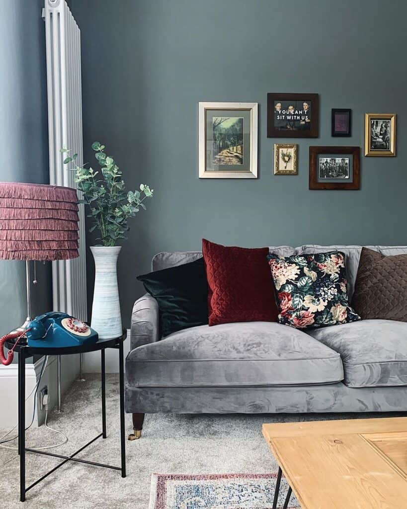
Red Interior Design
Red is an intense color, the most intense there is at evoking strong emotions.
You need to use red cautiously throughout your home but, if you get the balance right, you can radiate the luxury and confidence that can be found in many Mexican Interiors.
Decorating with red is best done using red as an accent color in your decor to make the room pop.
Listen up: in the living room red is a great choice for a sofa that’s contrasts against a white wall or gray flooring.
A bedroom red will work if you use it for a duvet cover and chairs in the kitchen or dining room.
What’s red’s complementary color? Green.
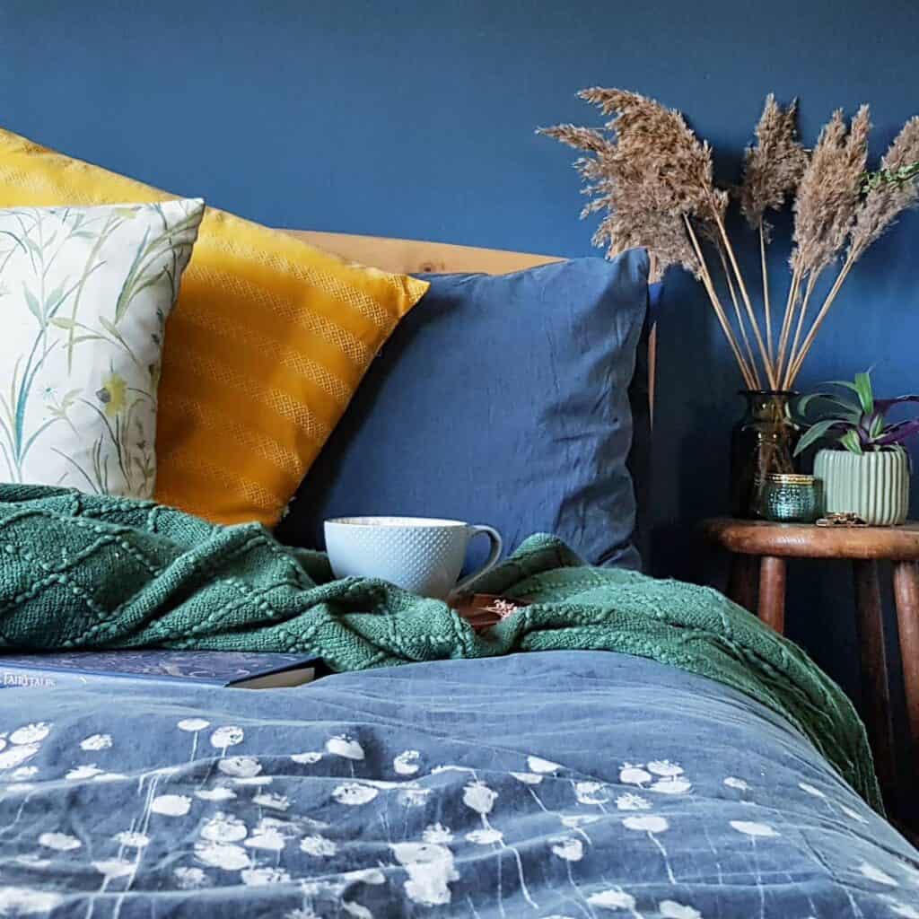
Blue Interior Design
Blue interiors look amazing in the sun.
It brings out the best of the blue tones, like in coastal-styled homes.
With this in mind, only add a lot of blue (especially dark blue) to rooms that will get a lot of natural sunlight or you’re going to create a cold and depressing room.
You don’t want that, do you?
Blue accents will look great on sofas, armchairs, or artwork.
In the bedroom, accent pillows love blue and a kitchen with rich blue cabinet doors looks classy.
What’s blue’s complementary color? Orange.
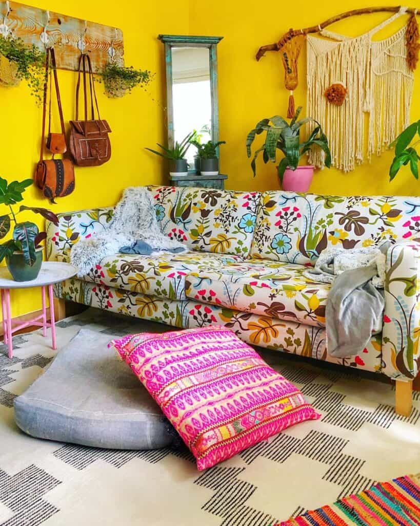
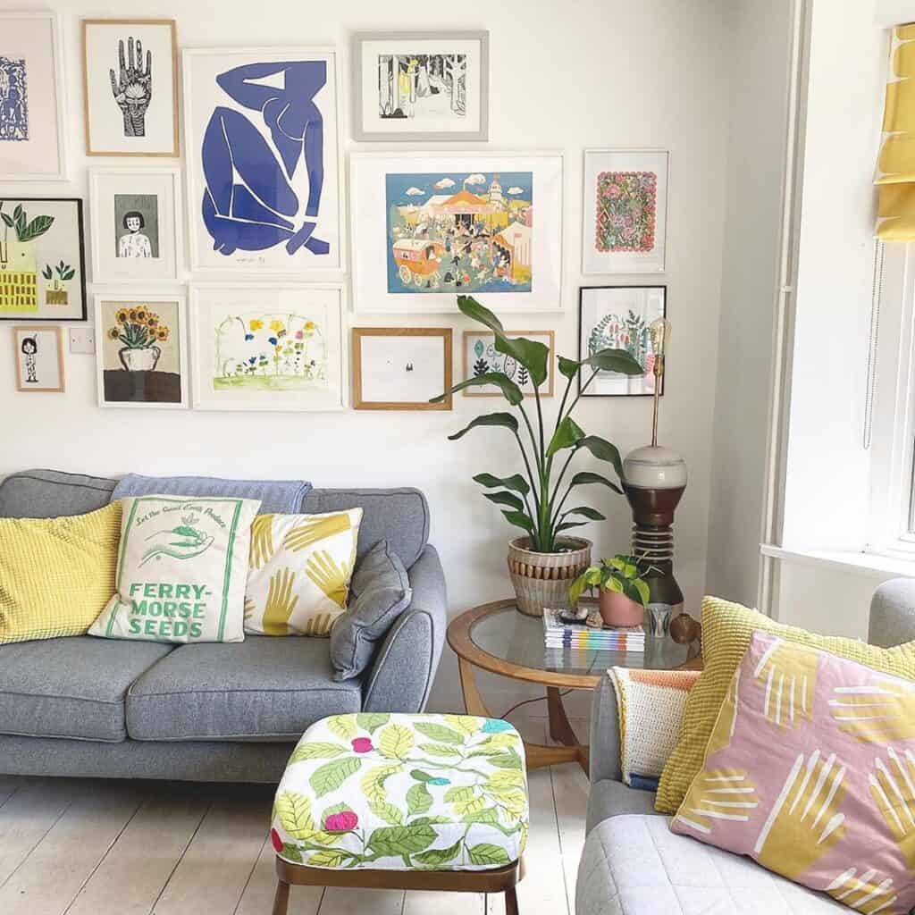
Yellow Interior Design
Are you looking to spread a bit of joy about your home?
Yellow’s the color you need to improve the psychology of anyone visiting and it also works really well with a black wall backdrop.
Rugs are a nice place to start by adding yellow accents, especially if you have blue sofa that you’d love to contrast against.
Tableware looks good with yellow as well and we’ve even seen a yellow rattan ice bucket.
We know…
You were waiting to see if you can include a yellow sofa, weren’t you?
Yes, you can, and you can see Rooms Solutions’ favorite yellow sofas here.
What’s yellow’s complementary color? Purple.
Leave a Reply